Analyzing my Tone in Charcoal Drawing

After I finished a larger drawing earlier, I’d been thinking about overall composition aspects of drawings and paintings. The number one thing was looking at exactly how much and in what amounts of tonal content a successful work has. My thinking lead me to the idea that maybe drawing and painting’s tonal content follows a sort of bell curve, as shown below.
:max_bytes(150000):strip_icc():format(webp)/LognormalandNormalDistribution1-7ffee664ca9444a4b2c85c2eac982a0d.png)
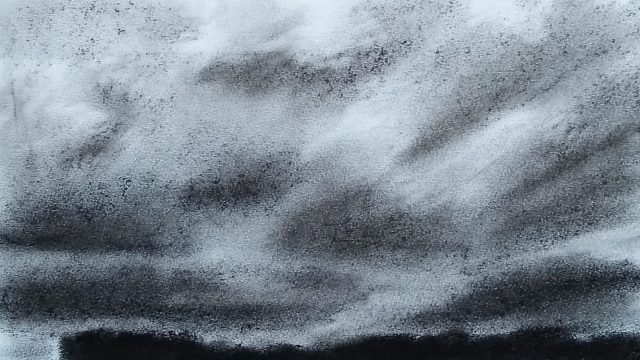
Take, for example, the drawing at the top of the post. The goal was to distribute the tone values according to a standard bell curve – or at least a reasonable approximation. In this manner of thinking, there would be only a small amount of the darkest tones and a similarly small amount of the very lightest ones. The greatest portion of the tonal values would then be in the center of the curve. Thinking of the bell curve got me considering or maybe focusing much more on the more judicious use of highlights in the landscape drawing. At the same time, I was really working on balancing down the cloudscape tones.
The reason I’m on this sort of topic was I produced a drawing earlier that had this sort of vibratory effect where the clouds and their dark and light patches would feel kind of like they were vibrating between foreground and background, like an Op Art piece. Of course, it could be just me, though.
Maybe this more ‘scientific’ manner of thinking about tone content in paintings and drawings will somehow help.